Clother
Mobile app-
About
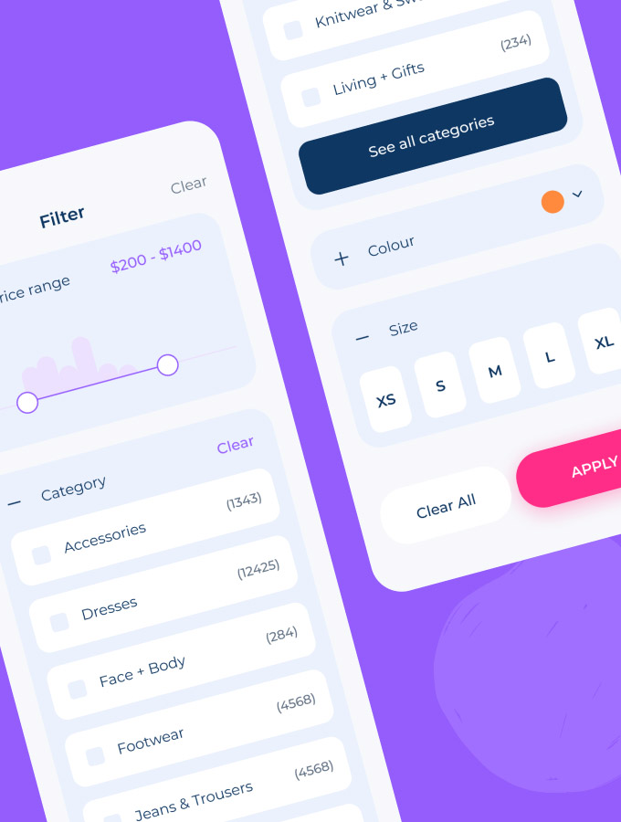
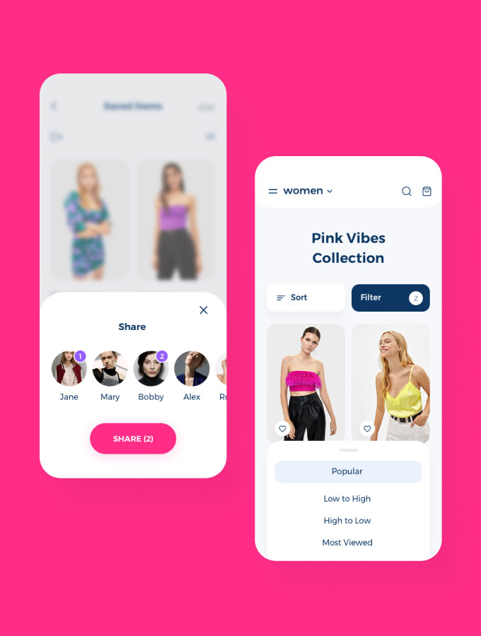
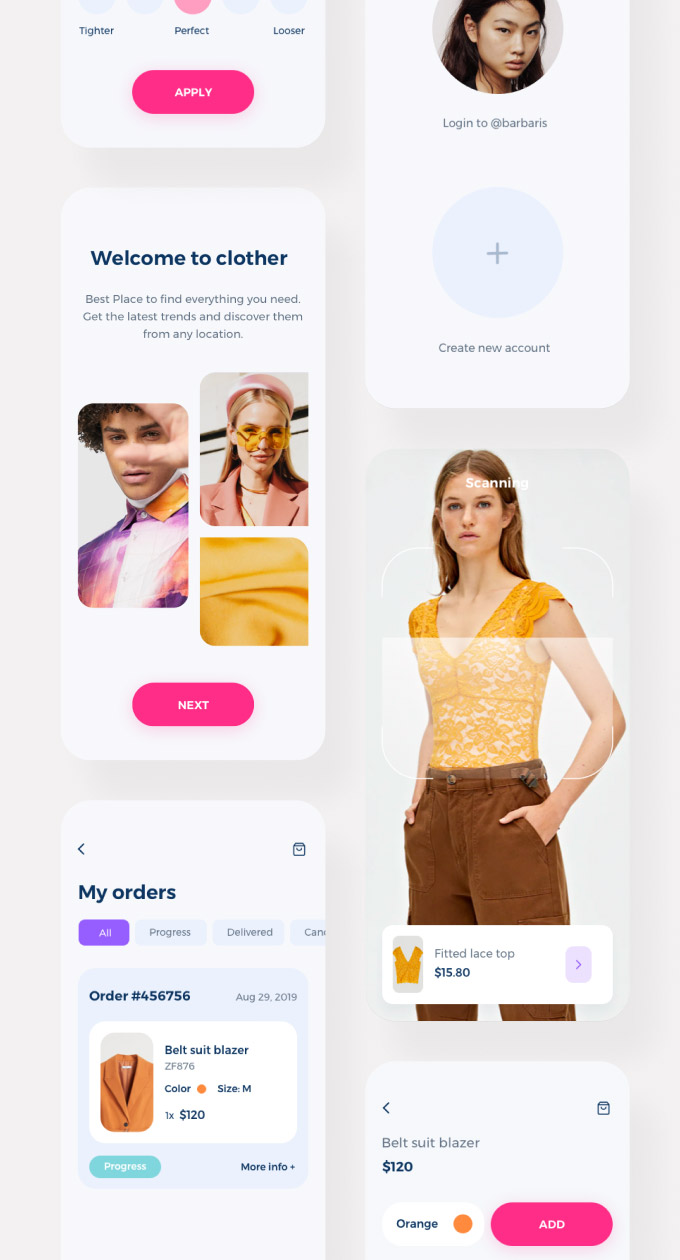
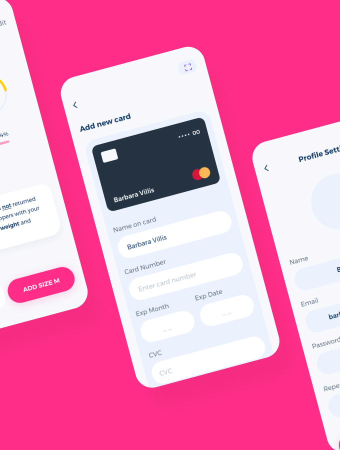
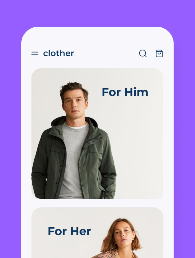
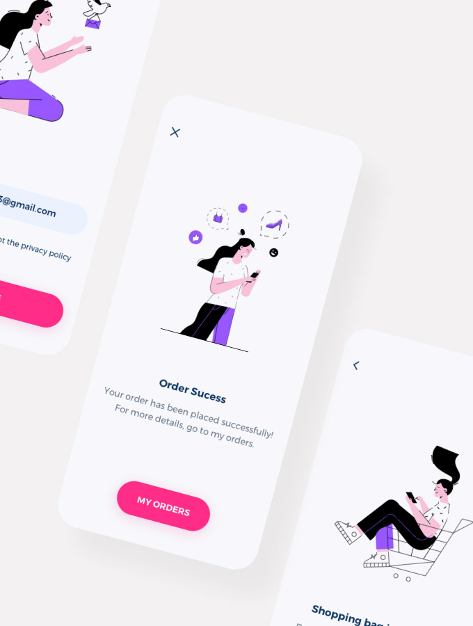
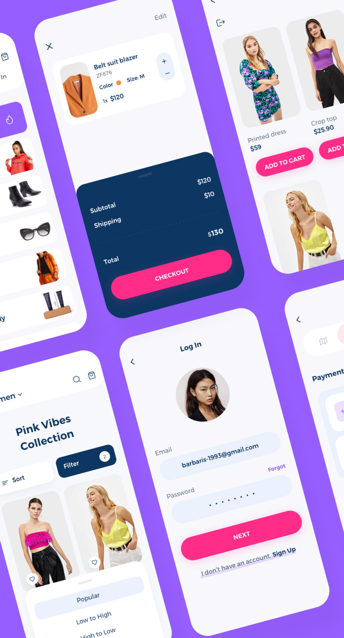
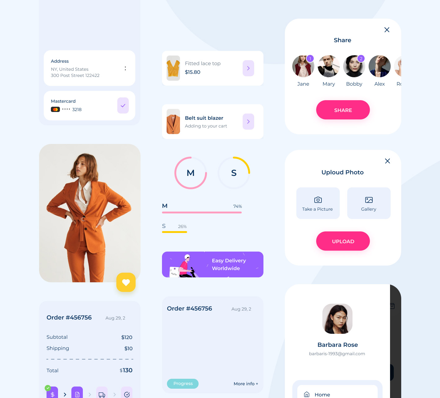
For Clother, we designed a comprehensive UI kit tailored for creating app components like product previews, fly pages, cart views, and more. The goal was to support Clother’s design team with a flexible, efficient toolkit rooted in user behavior and real workflows. We conducted in-depth research and gathered customer feedback to refine the user flow, ensuring the kit aligns with practical design needs. With a clean structure and adaptable elements, this UI kit streamlines the process of building engaging, user-friendly store interfaces.
-
-
-
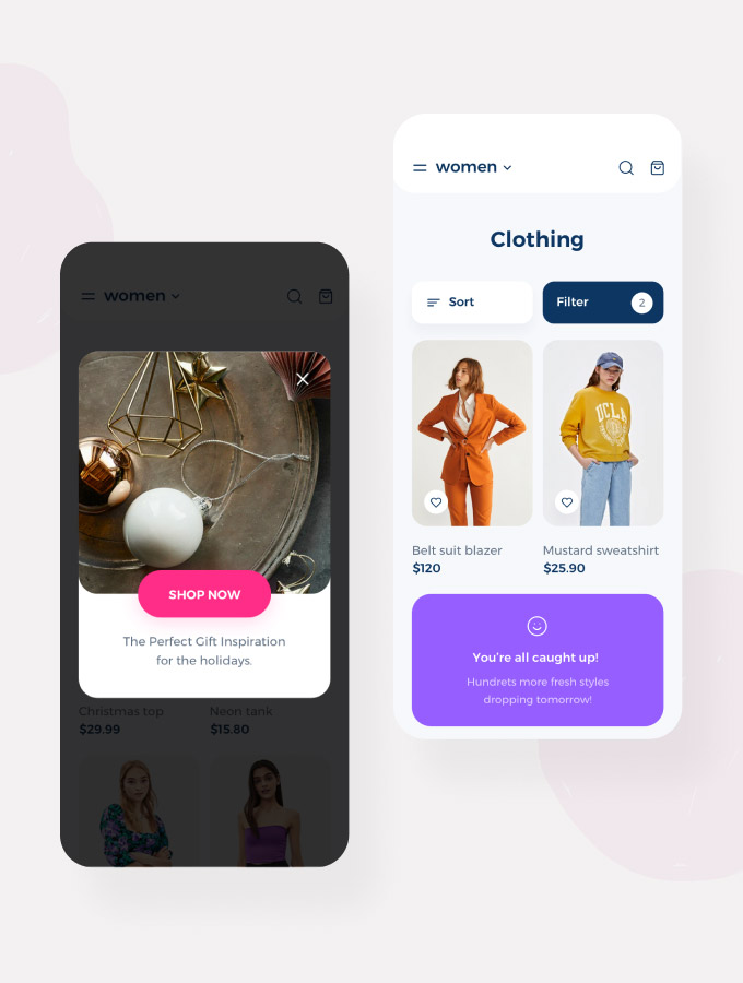
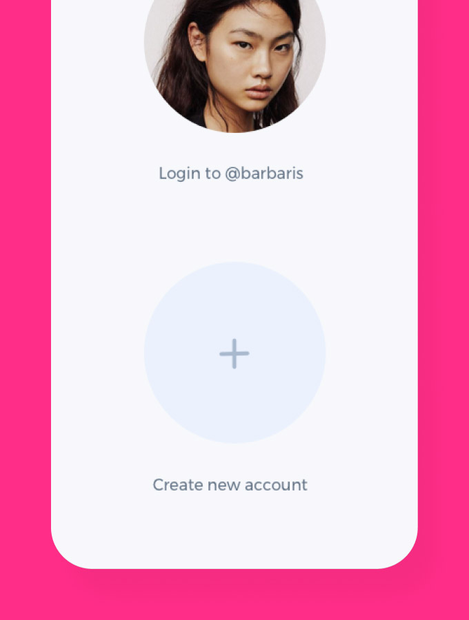
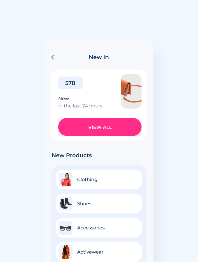
We created a minimalistic and user-friendly design with the help of simple fonts, shapes, and colors. Such an approach helps make navigation easier and find everything necessary in seconds.
-
-
-
-
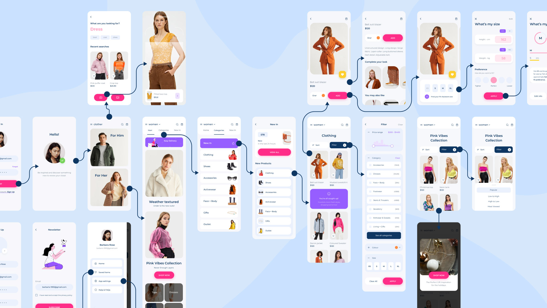
We used Miro to create the user flow to understand business customers better. And that knowledge lets us create the best user experience with a friendly interface.
-
Go check the entire case study on Emote Agency Behance page! You’ll find more details on designers’ tasks and how they’ve dealt with them. Lastly, do not forget to download the Clother app!
