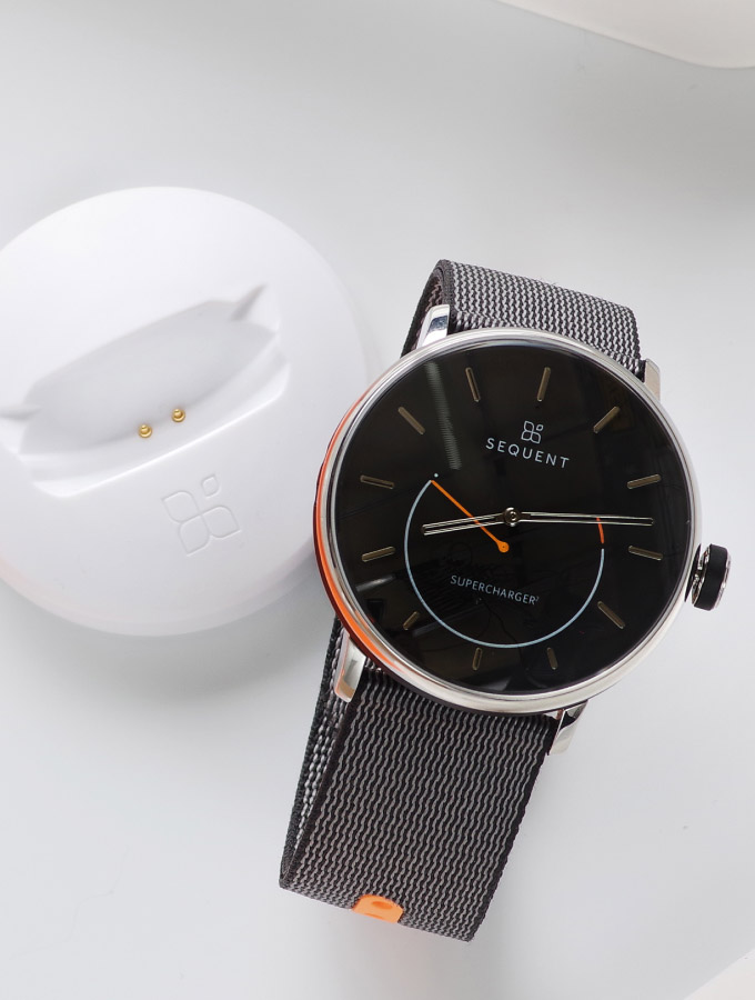
Sequent
Mobile app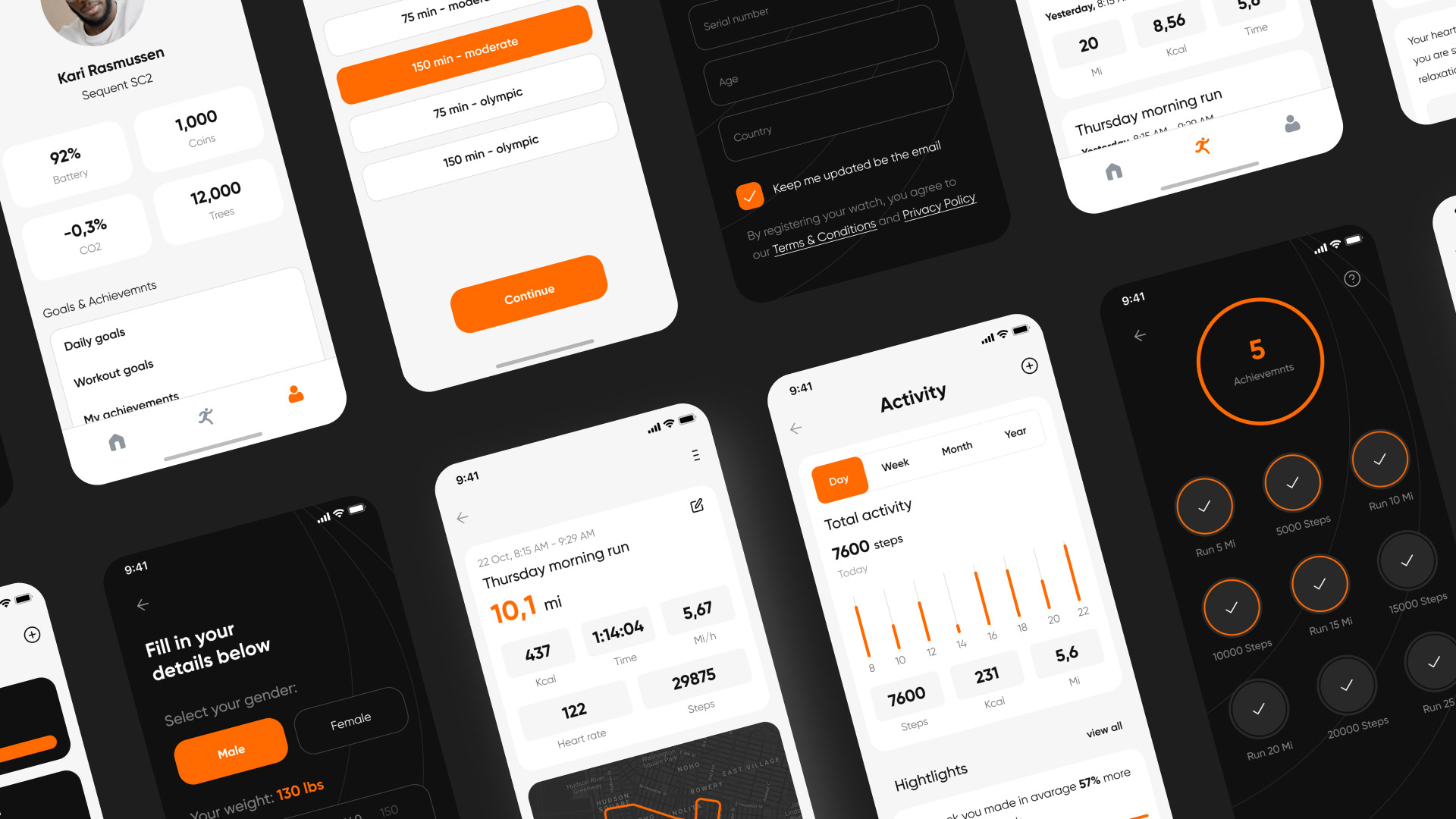
-
About
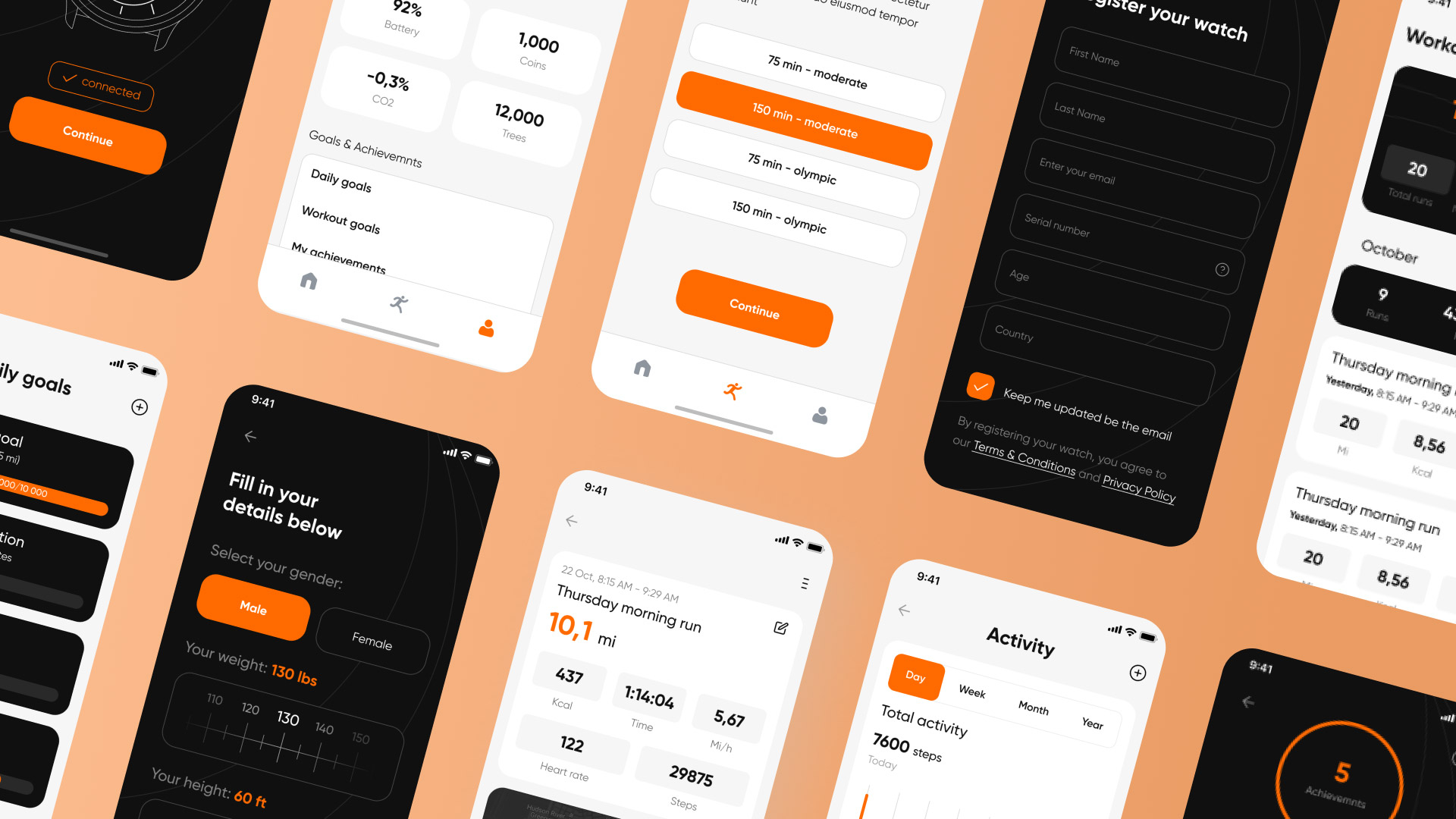
There’s always something to simplify and upgrade, right? We think the same. So do many users around the globe when it comes to smartwatch apps. What do you really need to use your life-tracking app for? Let’s say the sleep tracker to monitor sleep stages and overall health goals. But what if we tell you that there is an app that allows you to set your pack of necessary metrics?
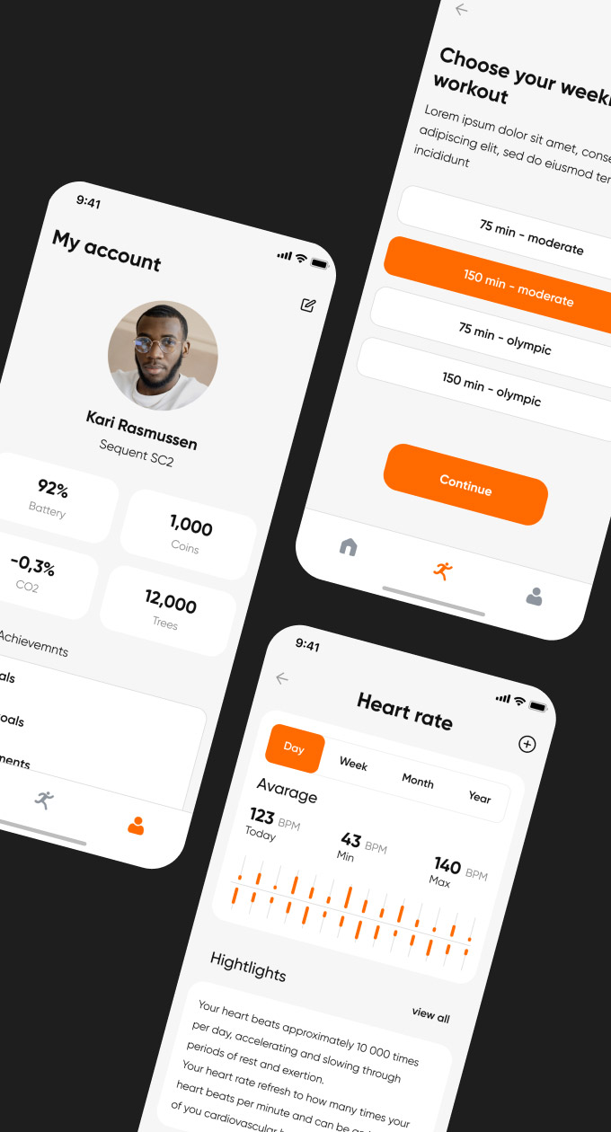
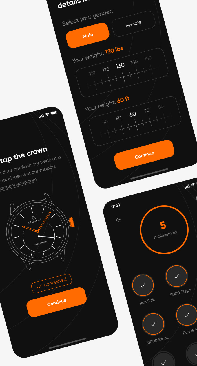
We know many similar apps, but they have so many parameters that most people don’t need! Our mission was to omit such service piling and create something minimalistic. It was also essential to keep everything in the brand colors — black, orange, and white. During this project, we had only one issue: how to place all these essential features and stay clean? We did the job with the help of the link system where we have general groups in the beginning and then move to particular components.
-
-
-
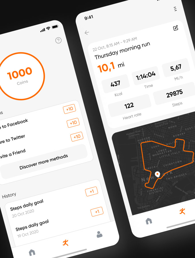
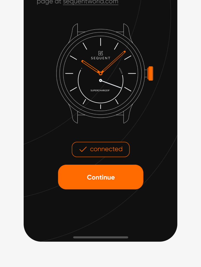
We had a brand book on our hands that helped us follow the brand’s identity and used it in this project. That’s why the final product is so clean and ready to implement into Sequent Universe.
-
-
-
-
The UI and UX design is based on analytics and has been tested to achieve the best results. We tested specific parts of an app with the help of different people to check how they understood our ideas.
-
